the 2019 color palettes
The home is the story of who we are. Stated by the things we take care of and the colors we surround ourselves with" - Lisbeth Larsen, Global Color Manager at Jotun -
After I have been enormously inspired these past few weeks by the images of the launches of the 2019 Scandinavian color palettes, last week the color of the year for the Netherlands, Spiced Honey by Flexa, was lauched in a special live broadcoast at facebook. Spiced Honey is a warm amber color, inspired by the beauty of honey. Spiced Honey can be soothing, cozy or lively depending on the palette with which you combine it and in my opinion, it actually fits beautifully with the palette chosen by Scandinavian paint producer Jotun lady.
- Spiced Honey- color of the year 2019 by Flexa
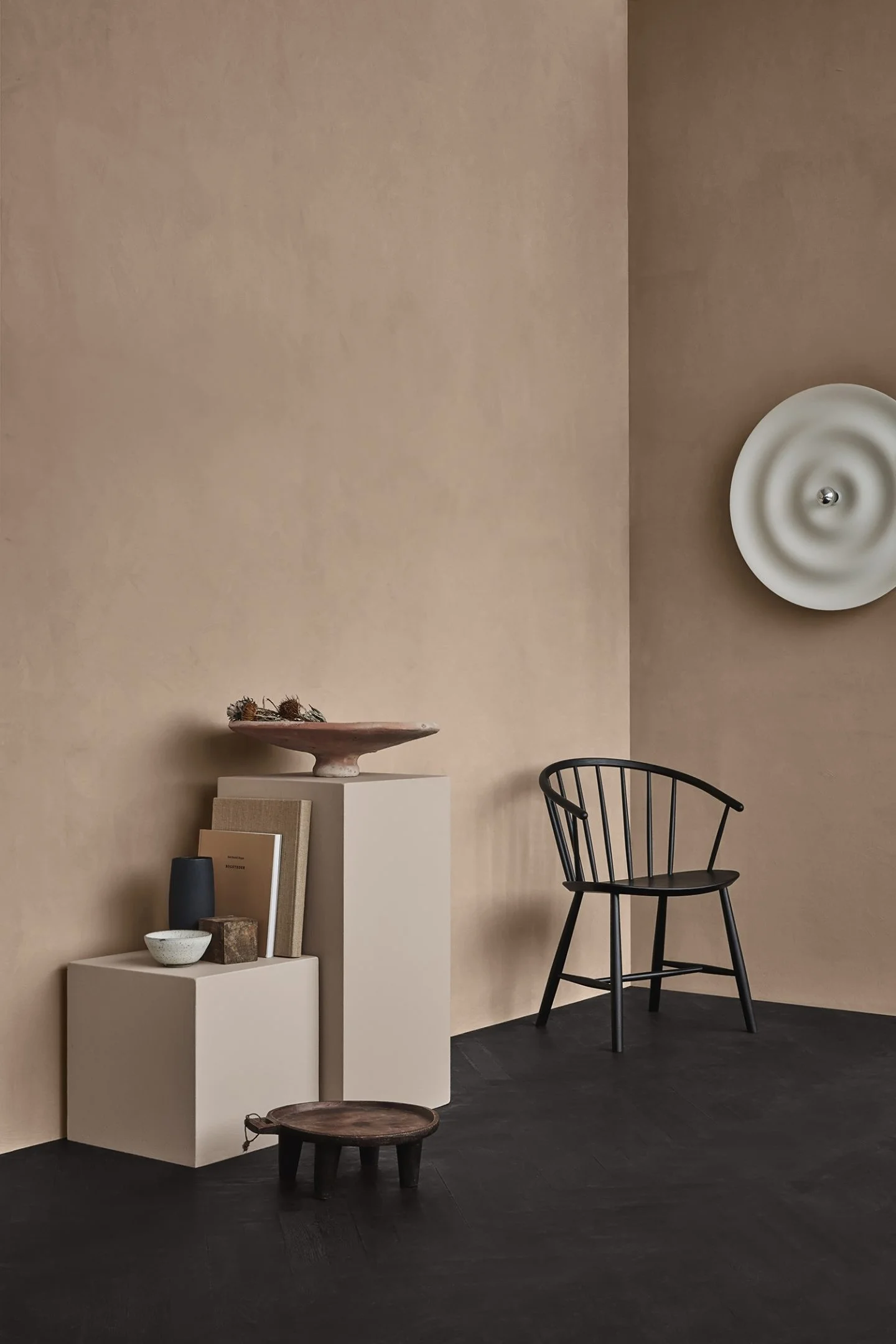
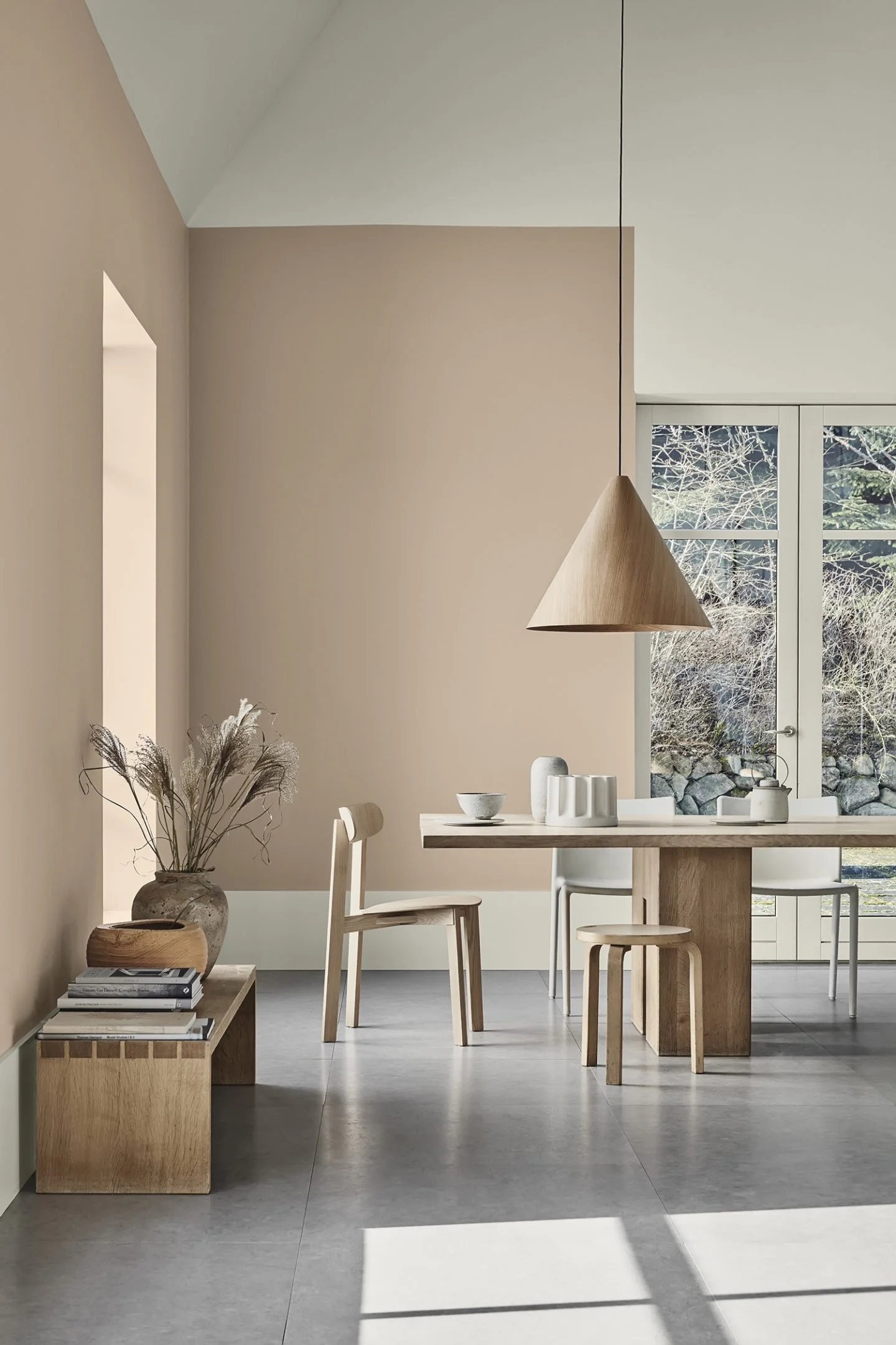
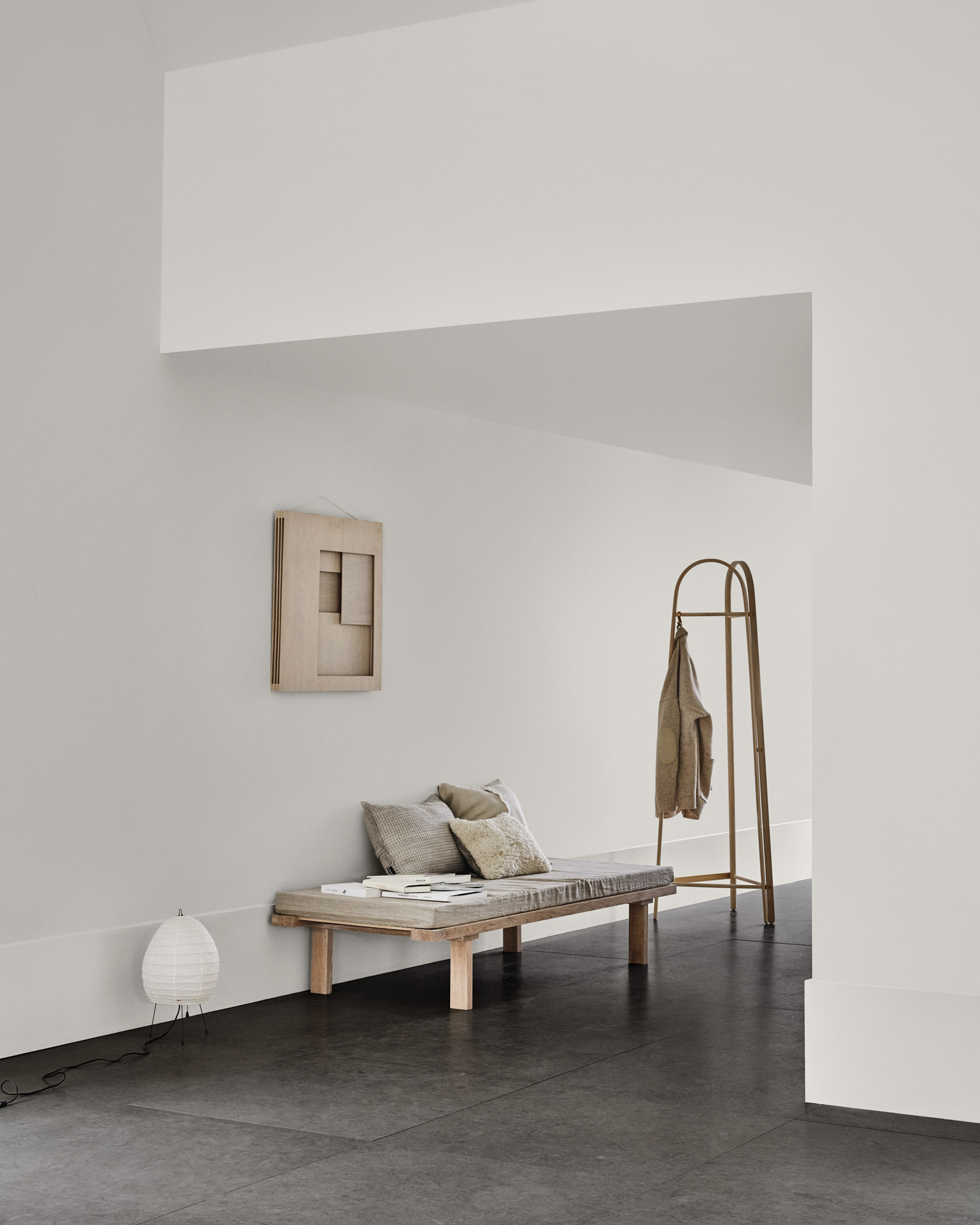
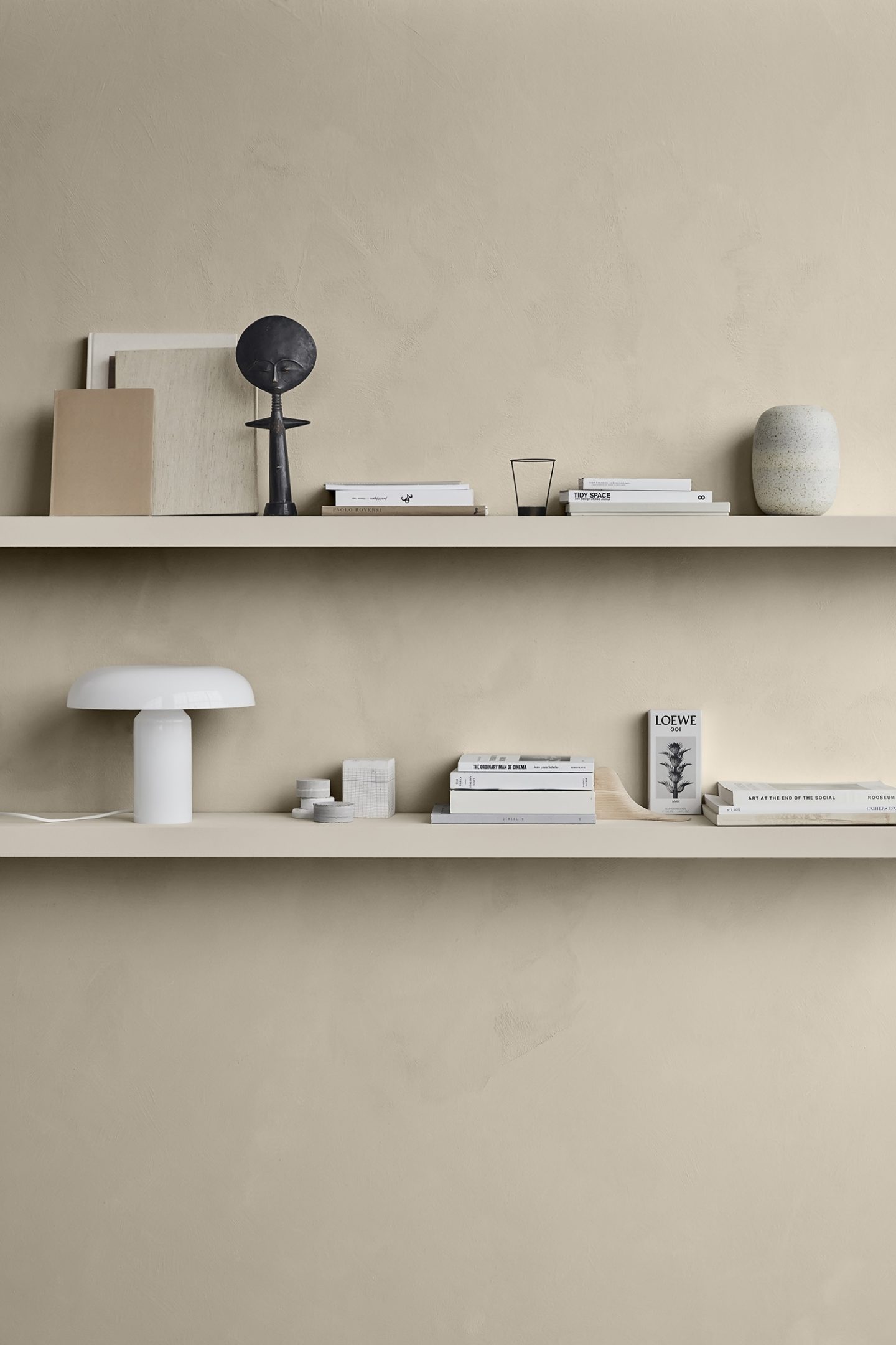
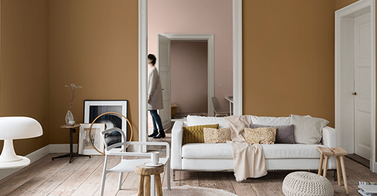
The new Scandinavian chart "Identity" presents 28 contemporary colors that reflect trends and trends in modern urban life. To illustrate how different color combinations can be employed to communicate different identities the color chart contains three themes - three stories about personalities and mindset, perfecly told with colors by stylists Kråkvik and D´Orazio and photographer Line T. Klein.
"CALM" has a focus is on the beautiful and simple Nordic minimalism and a Zen-inspired atmosphere. The soft, neutral shades of the calm palette and warm subtle contrasts just reflect this. "REFINED" has a healing expression in which vintage treasures, single design items and art bear witness to a delicious sense of aesthetics and the identity "RAW" is earthy and values the honest and genuine.The palette's warm earth colors and neutral gray shades underline this rustic style.
I guess, in our home I actually have combined “calme” and “refined” by the use of colored canvas and accessories. The addition of a small touch of spiced honey would be great don’t you think so?
-Elvera-